Case Study: Annual Reports Don't Need To Be Boring
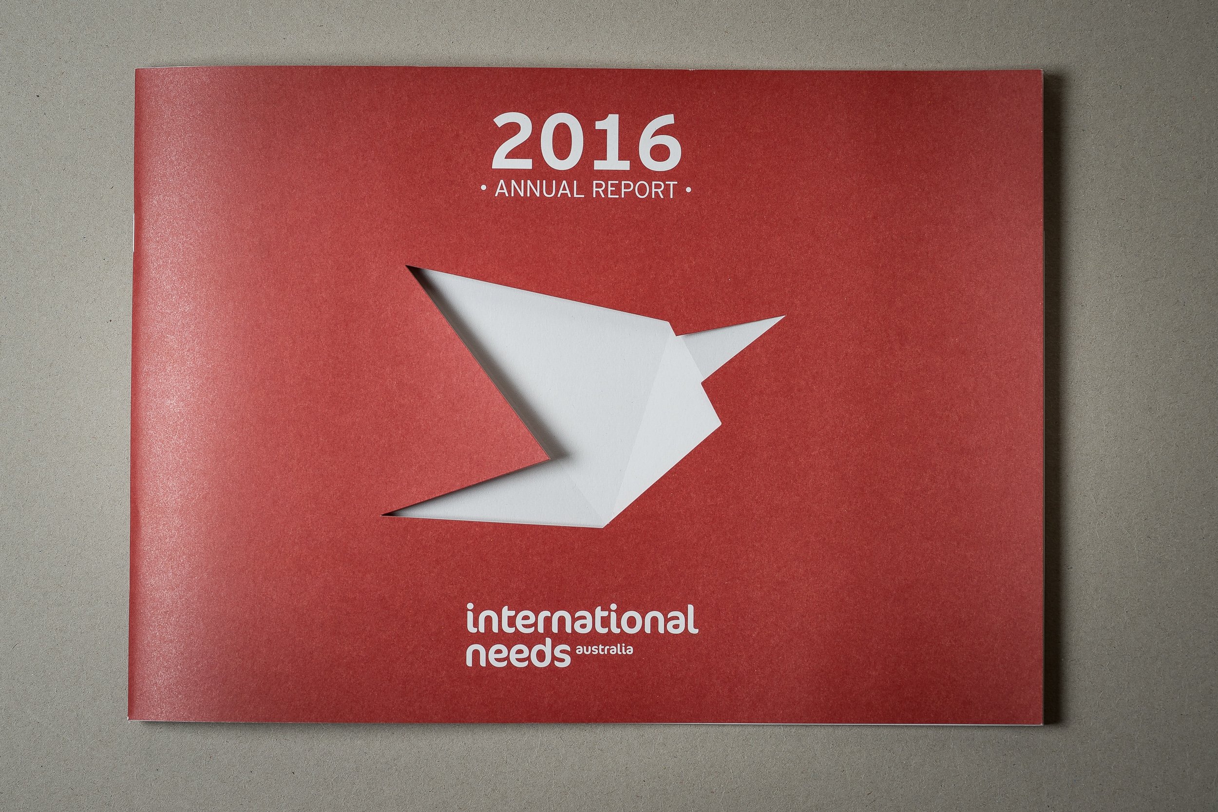
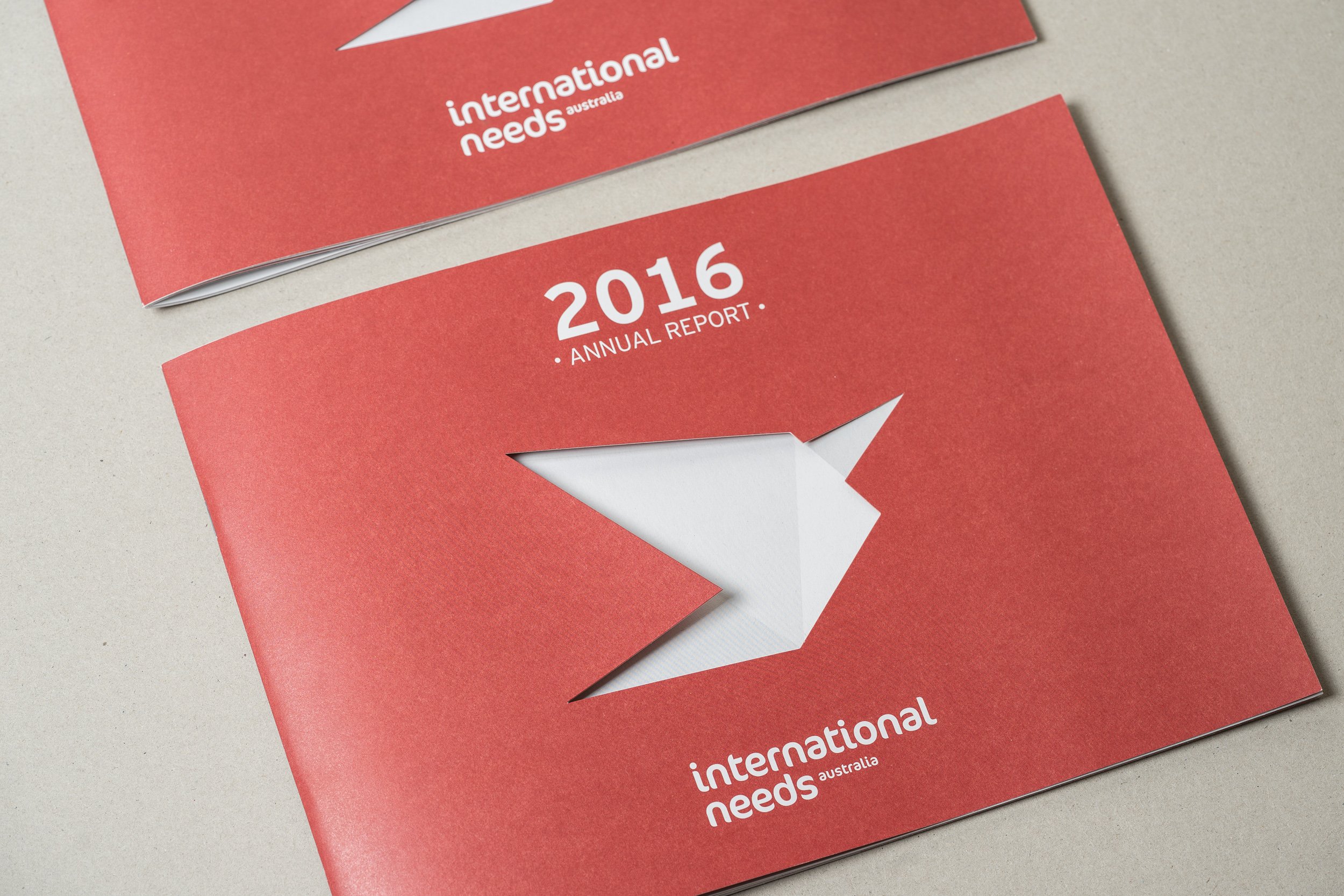
This is the third year in a row that I have designed International Needs Australia's Annual Report. Each year brings with it the challenge of making the design communicate better than the previous year. For the 2016 Annual Report, INA had a new logo and brand guidelines to work with which was really fun.
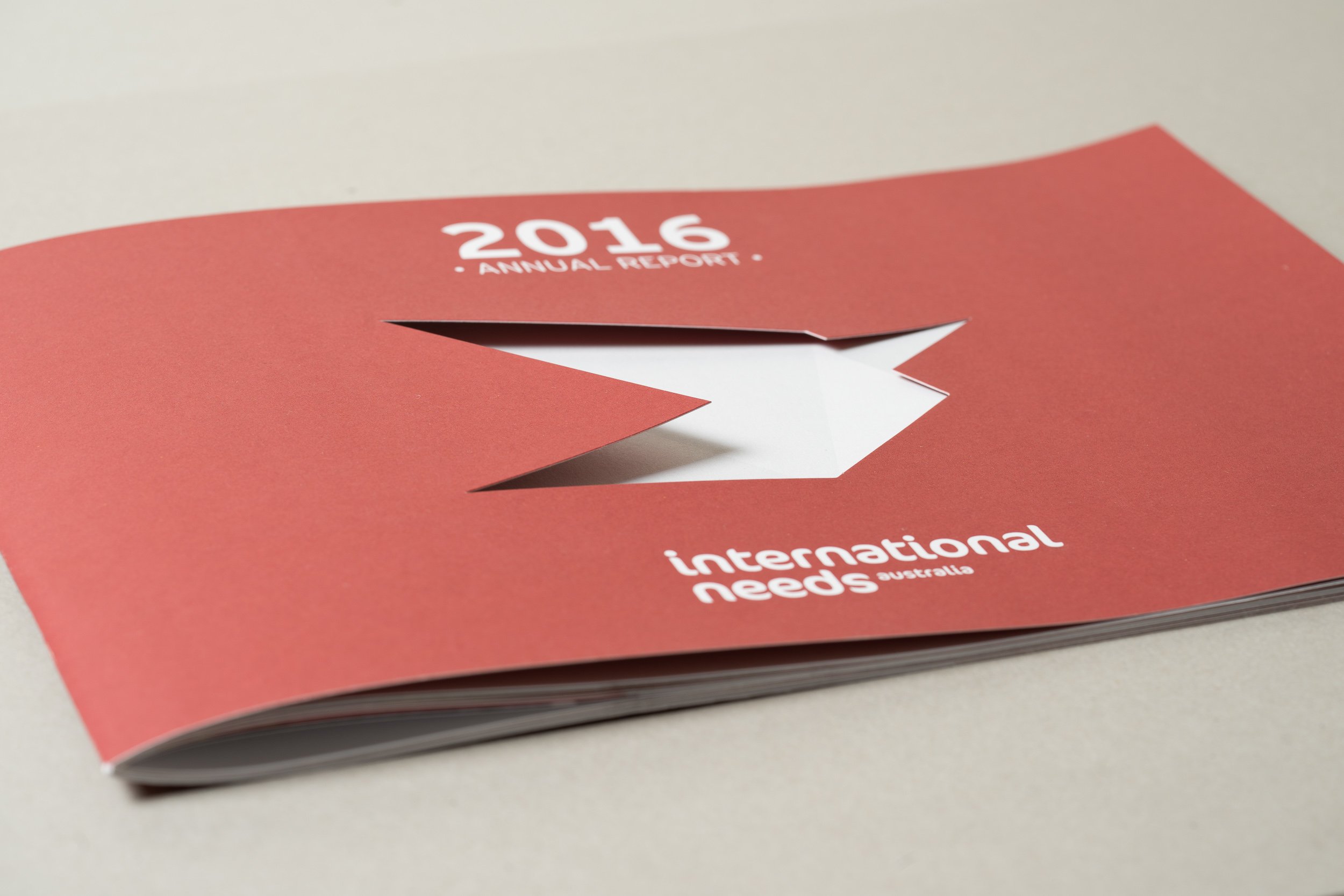
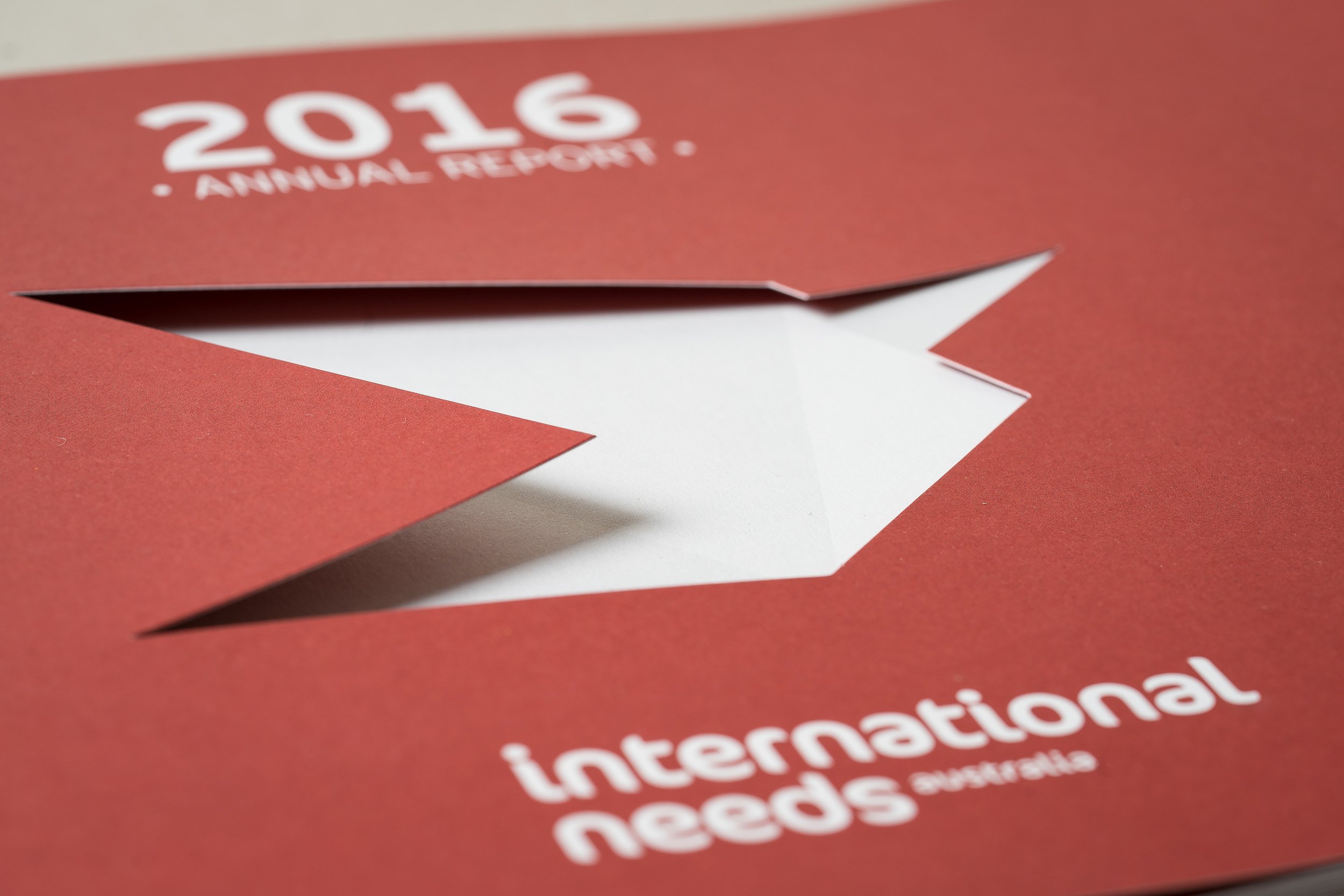
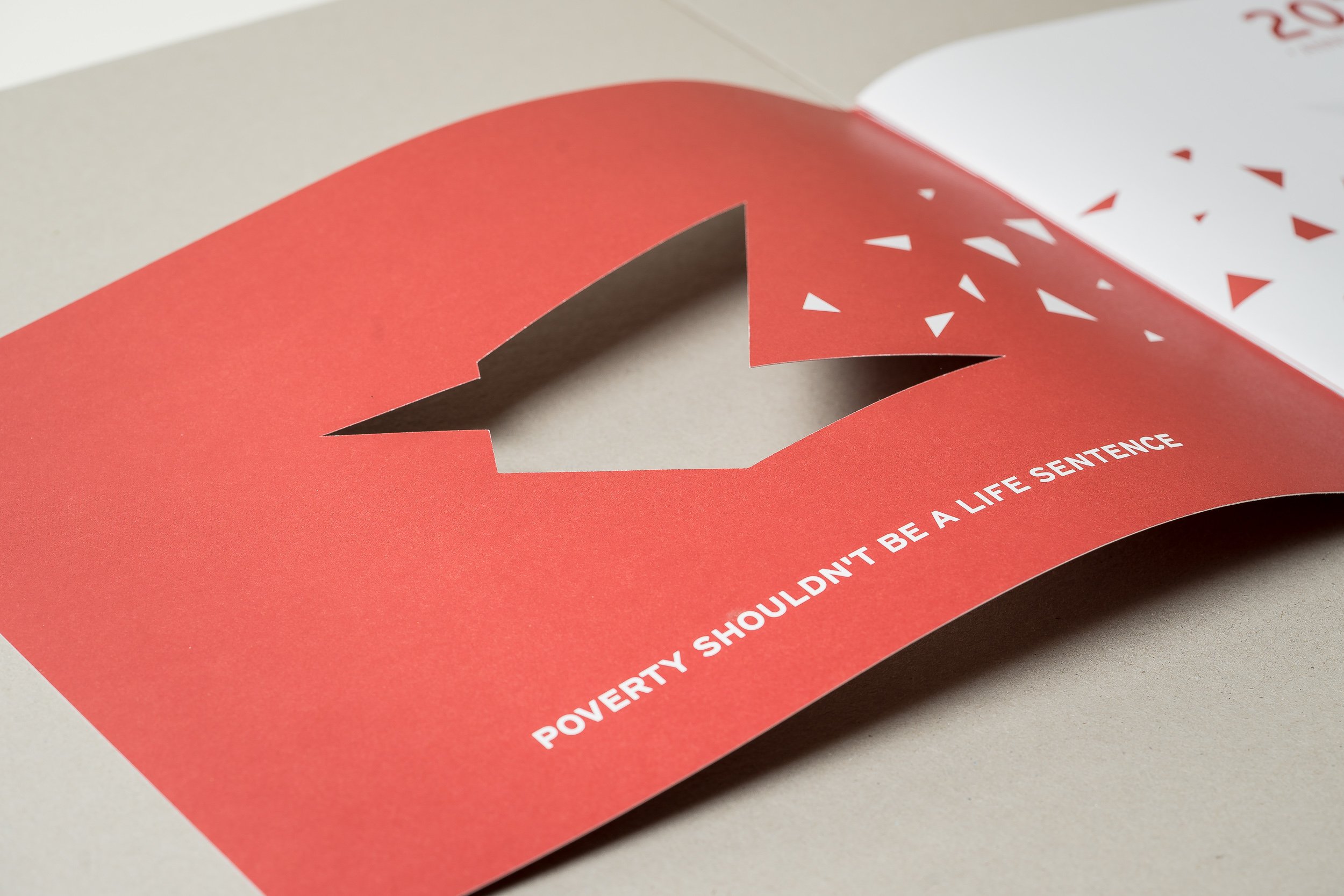
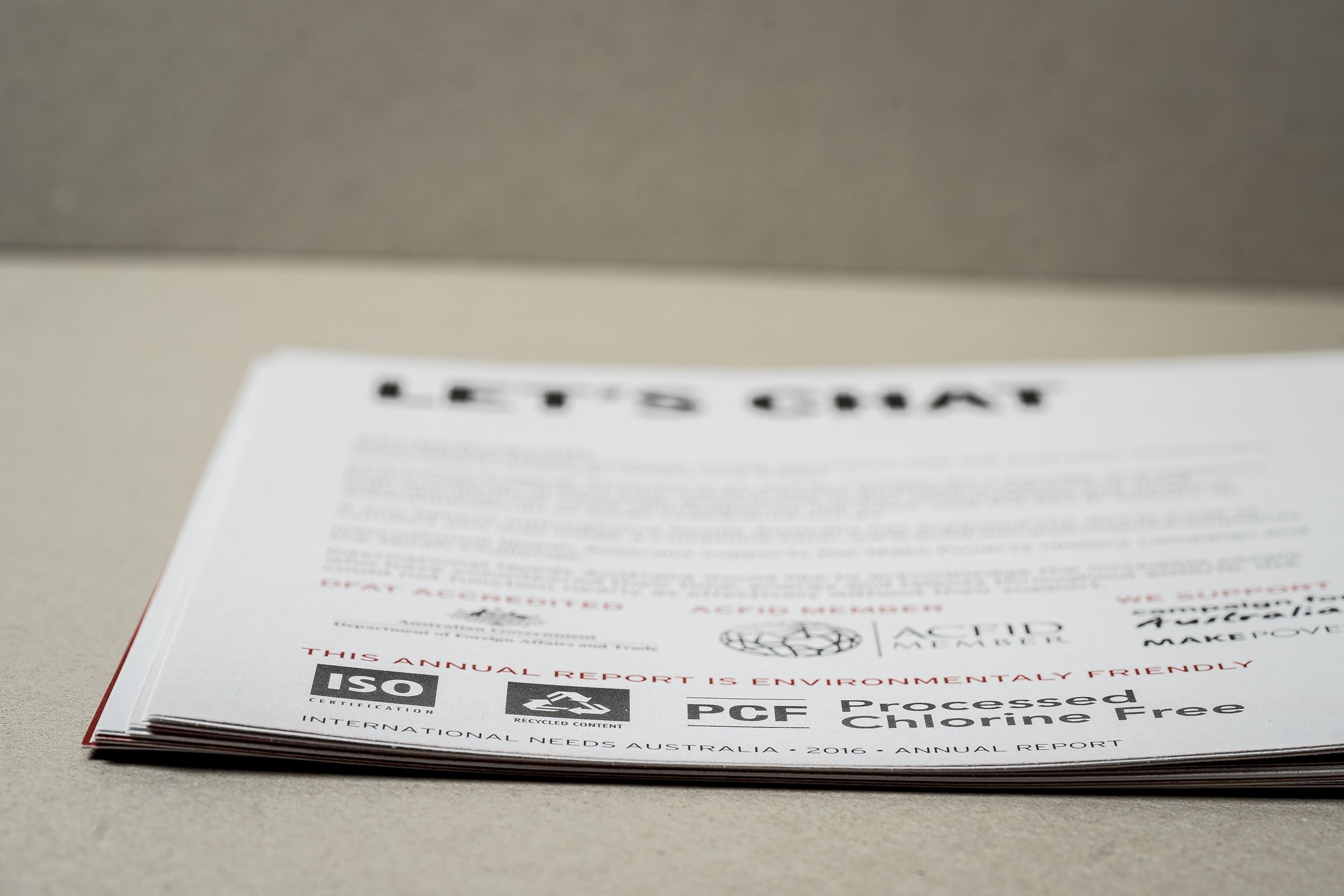
I've played around with UV printing before but this is my first die-cut job. It was really one of those 'less-is-more moments' which allowed us to highlight the new logo and even use the flip-side of the front cover to continue telling the brand story.
I also really enjoyed transitioning this report from a more traditional portrait design to a more modern landscape design. We changed the paper stock from glossy to recycled matte to reflect the organisation's sustainability values. My philosophy with this publication is that regardless of the amount of design investment, it is still going to take a lot of time and effort from multiple people to produce. If this time and effort is already going into the content, it seems wise to capitalize on it and turn it into a piece of communications that people will actually want to read and that the organisation is proud of.
NGO's have high standards they need to reach when it comes to communications and reporting. I've spent enough time reading the ACFID Code Of Conduct to know that the bar is set high. So when I design reports like these, or make content for other similar organisations, from the outset I am focused on ensuring brand communication complies with sector standards.
An NGO Accreditation Organisational Review of International Needs Australia for DFAT included the following comments about the Annual Report which I designed:
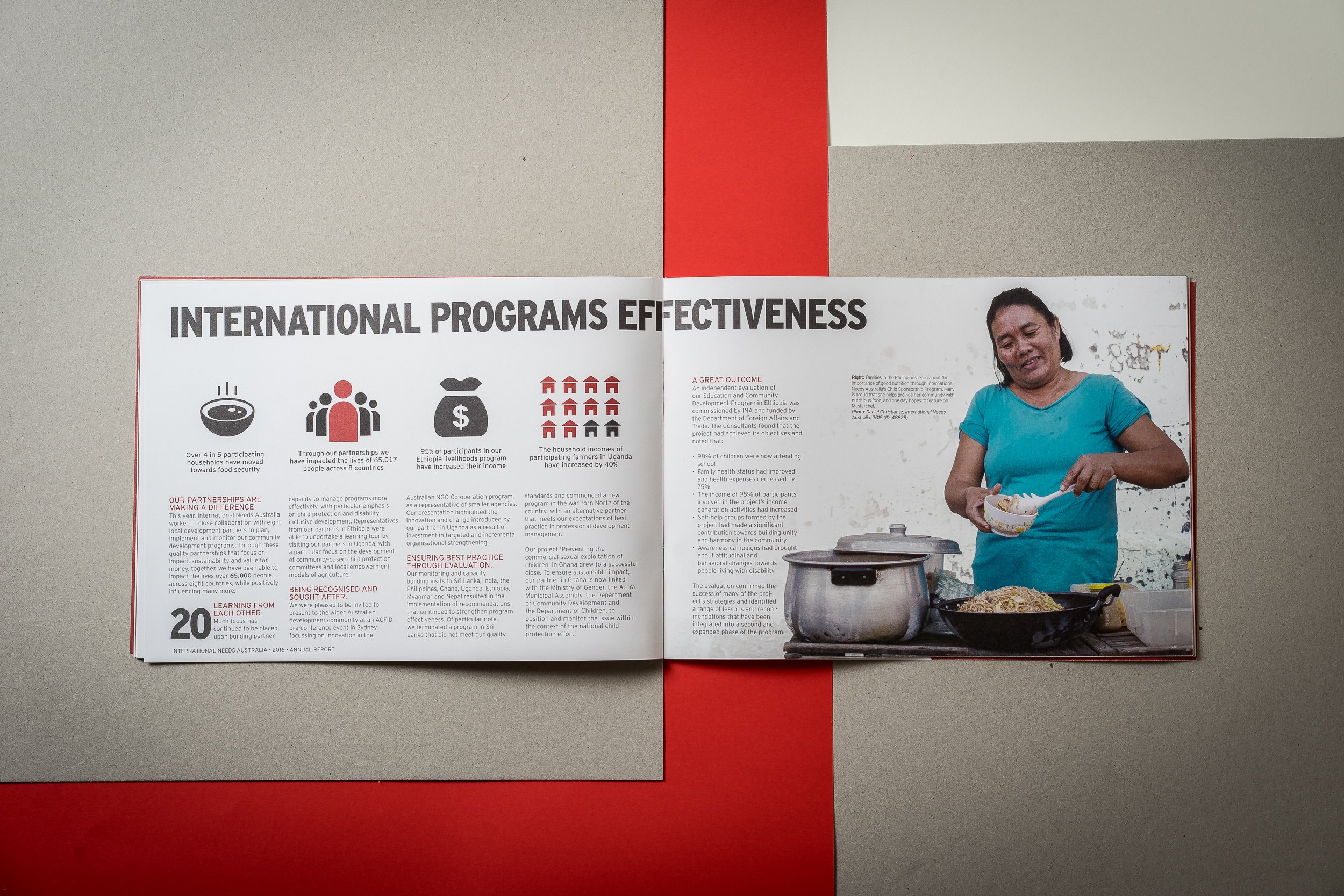
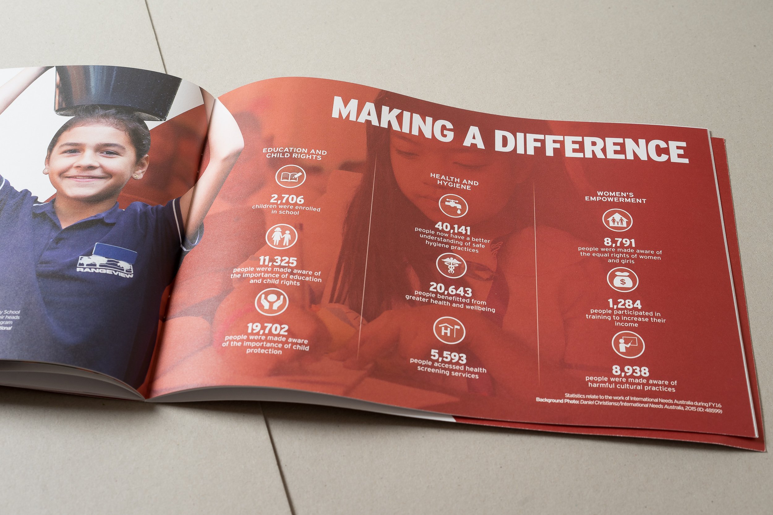
'The Annual Report presents as the ‘gold standard’ with highly relevant, positive images, complete with attribution to the project, photographer, and image identifier. Significant quality assurance processes were demonstrated, with multiple drafts and editorial commentary.'
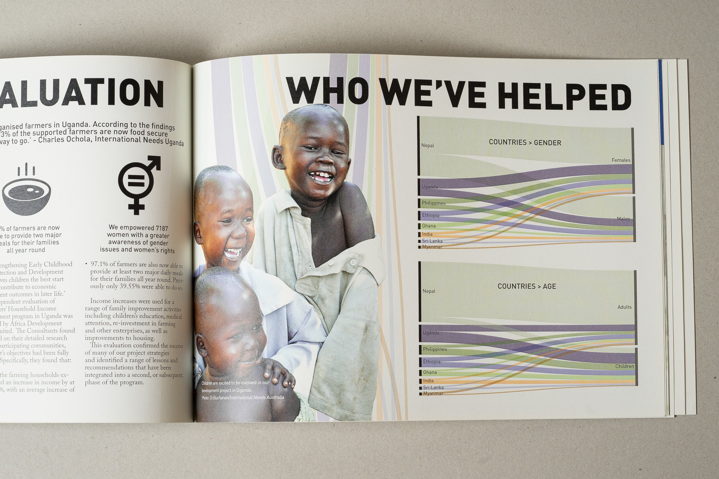
One thing which really helps with reports such as these are professionally captured photos. A photo that looks nice on your phone or tablet often doesn't cut it for print as the dots per inch is usually much higher in a print job like this. Professional photos also give more options for cutting out images and using them in more abstract contexts. Whether you hire me or someone else, I highly recommend getting a professional in to take photos for your print publications.
I also suggest thinking ahead for publications such as these and ensuring that your organisation is continually maintaining a high quality image library with appropriate metadata tags (I've set clients up in Daminion and Flickr, but MerlinOne also looks like a great option - the system really depends on your needs and budget). Make sure your designer can access the best quality photos quickly so that you aren't paying them to sort through folders and folders of irrelevant and low quality images.
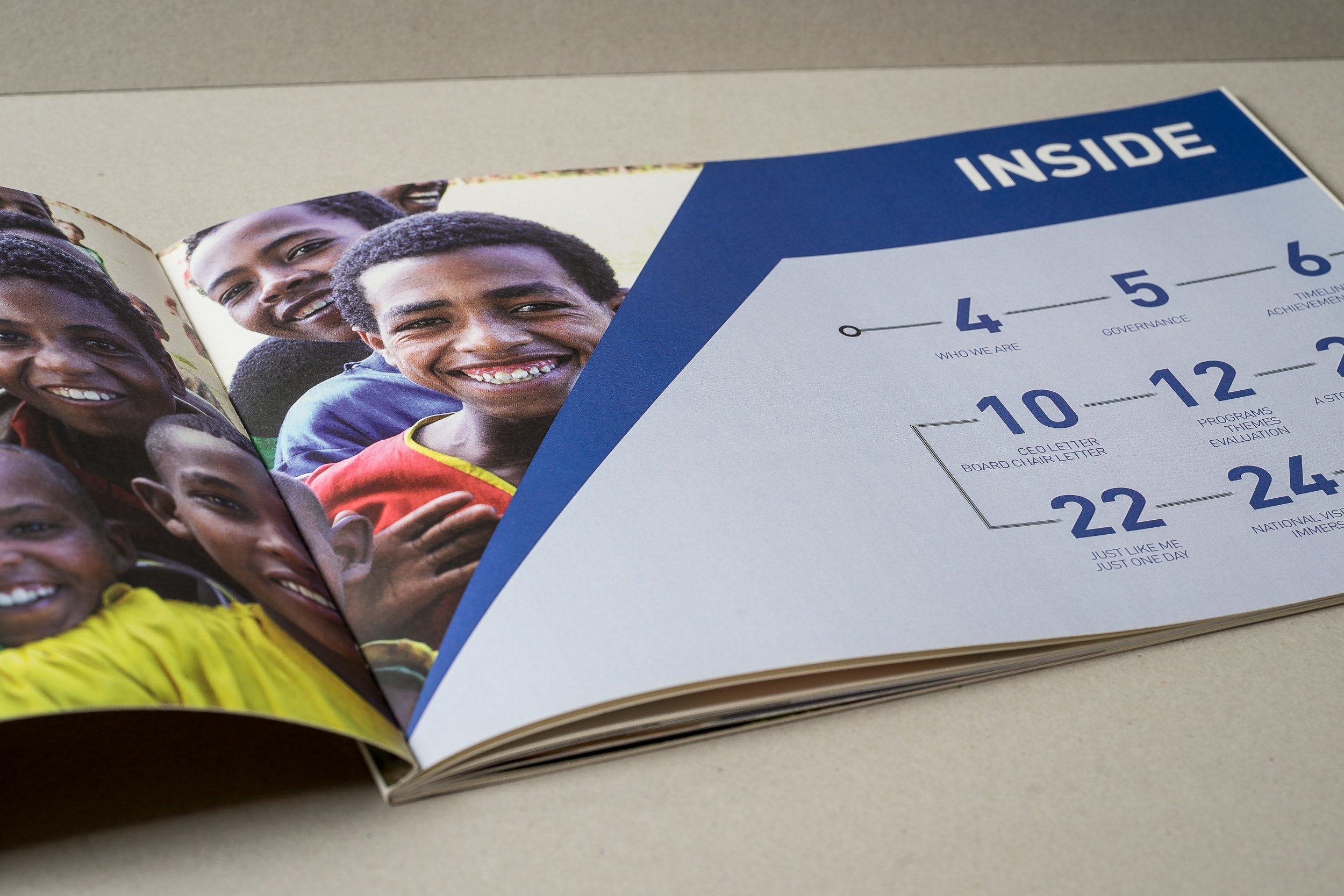
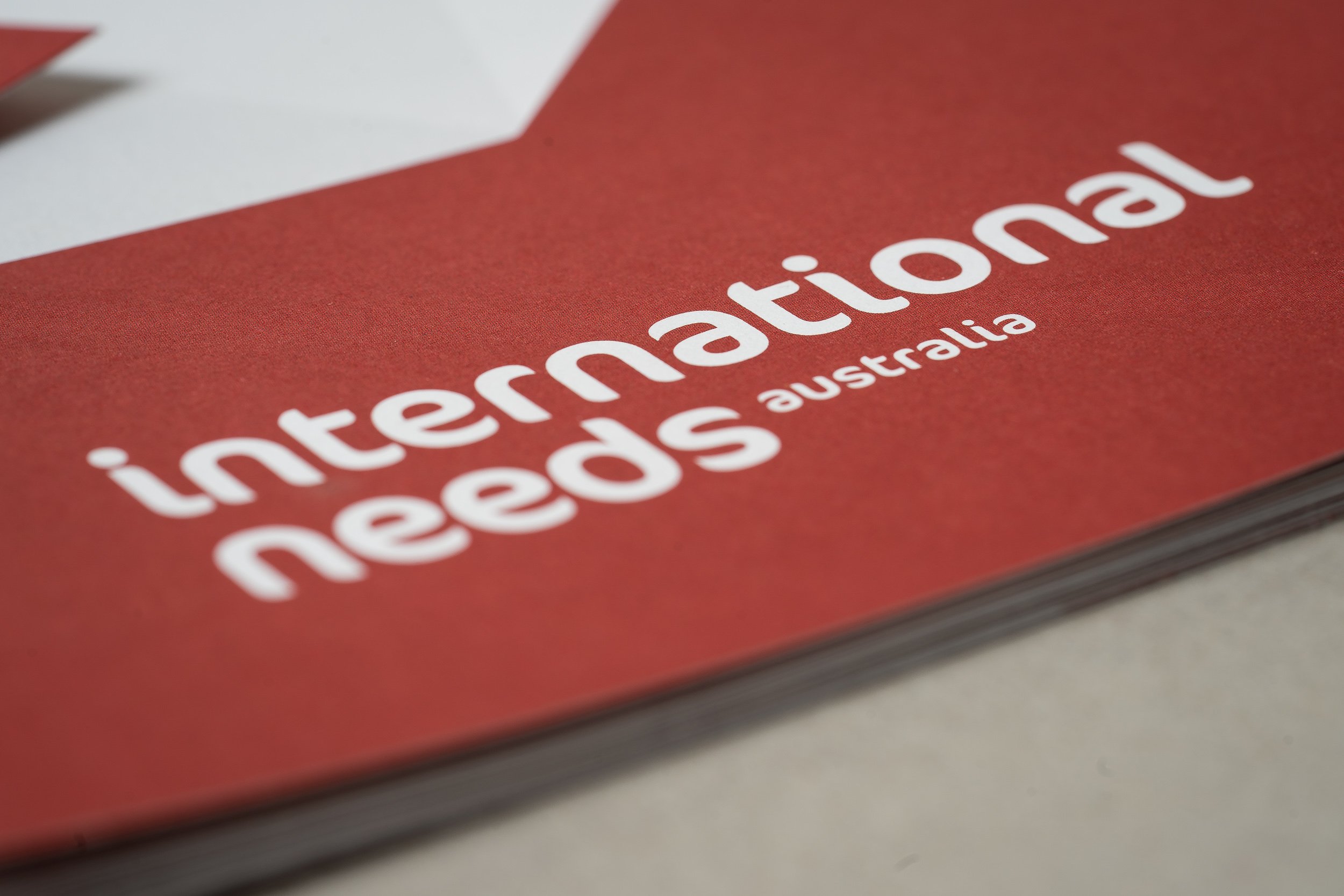
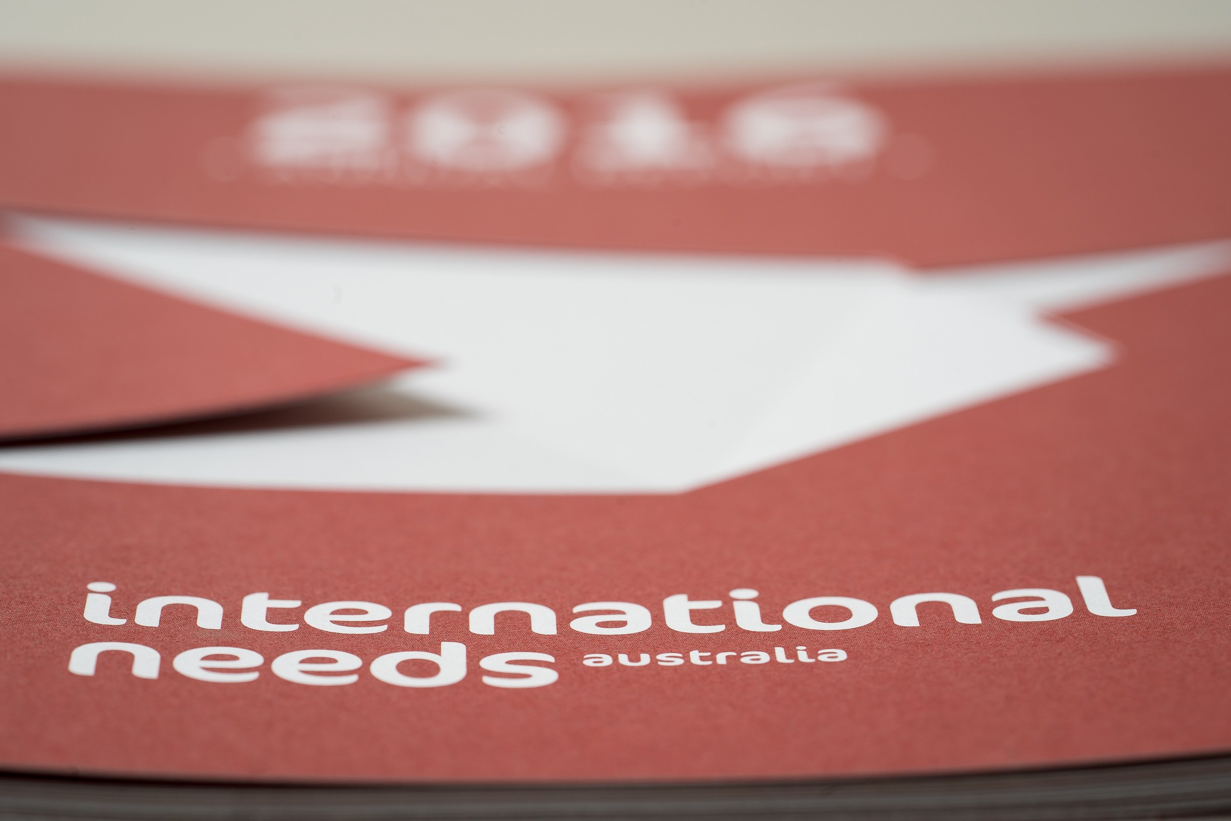
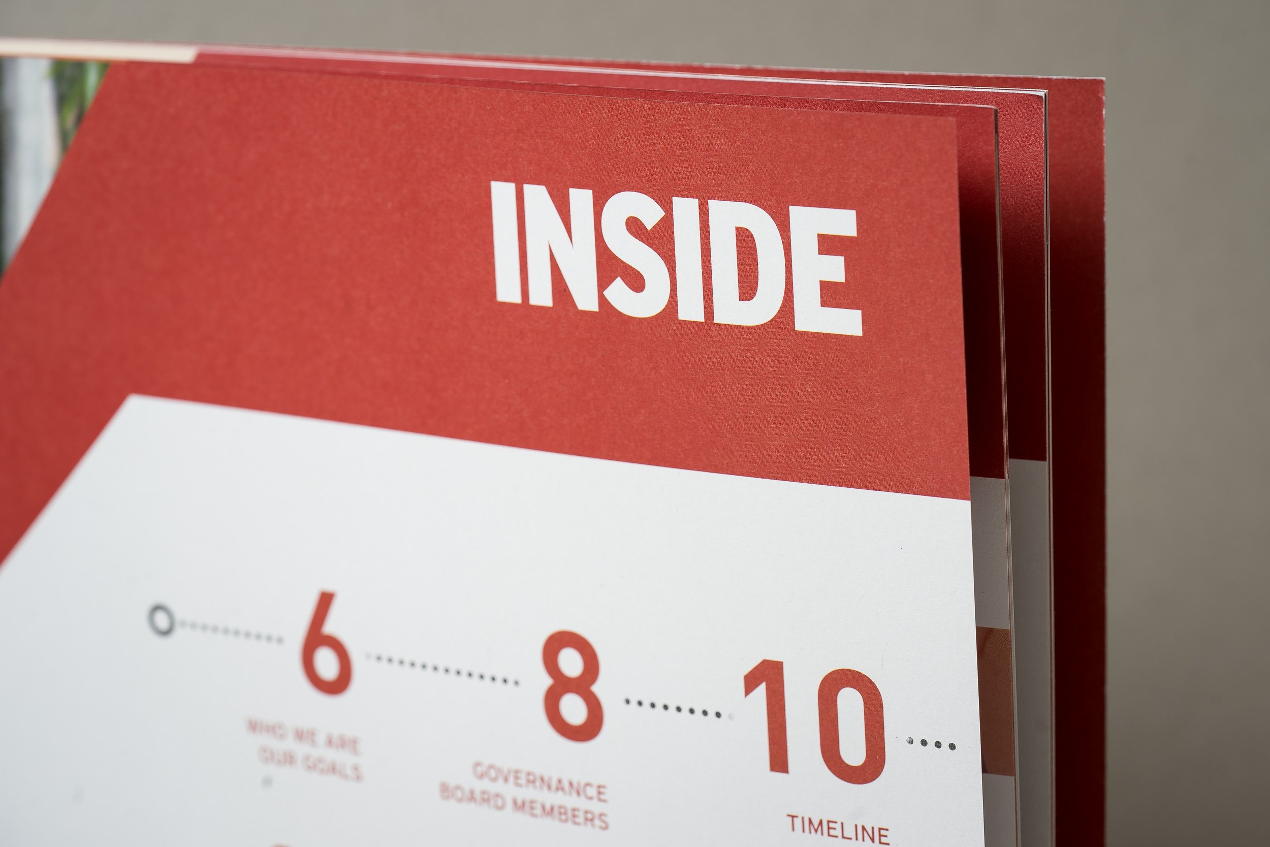
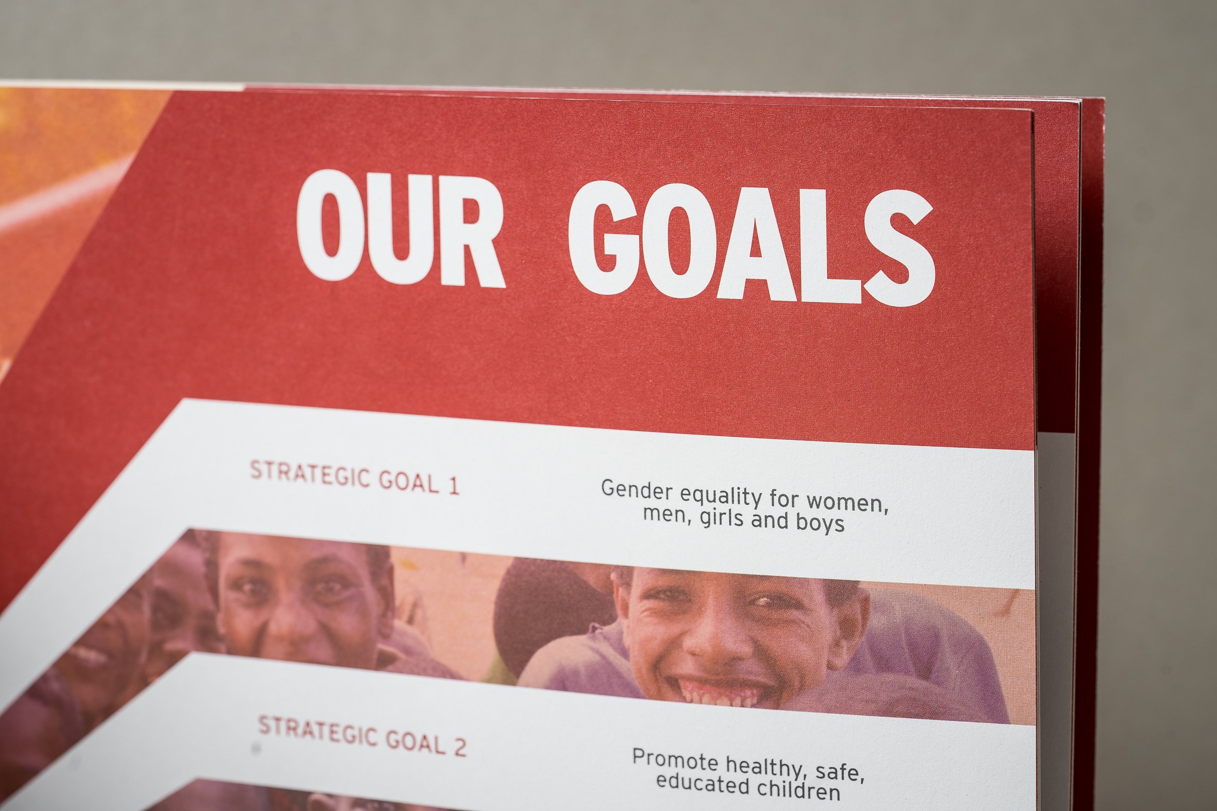
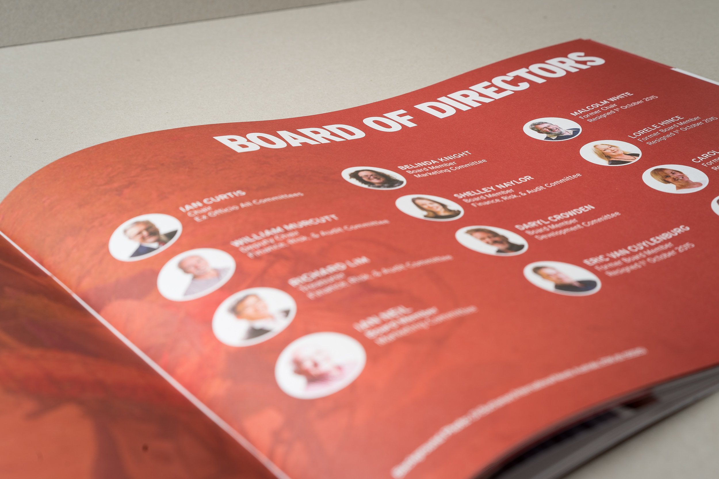
Here are some photos of the 2016 Annual Report below:

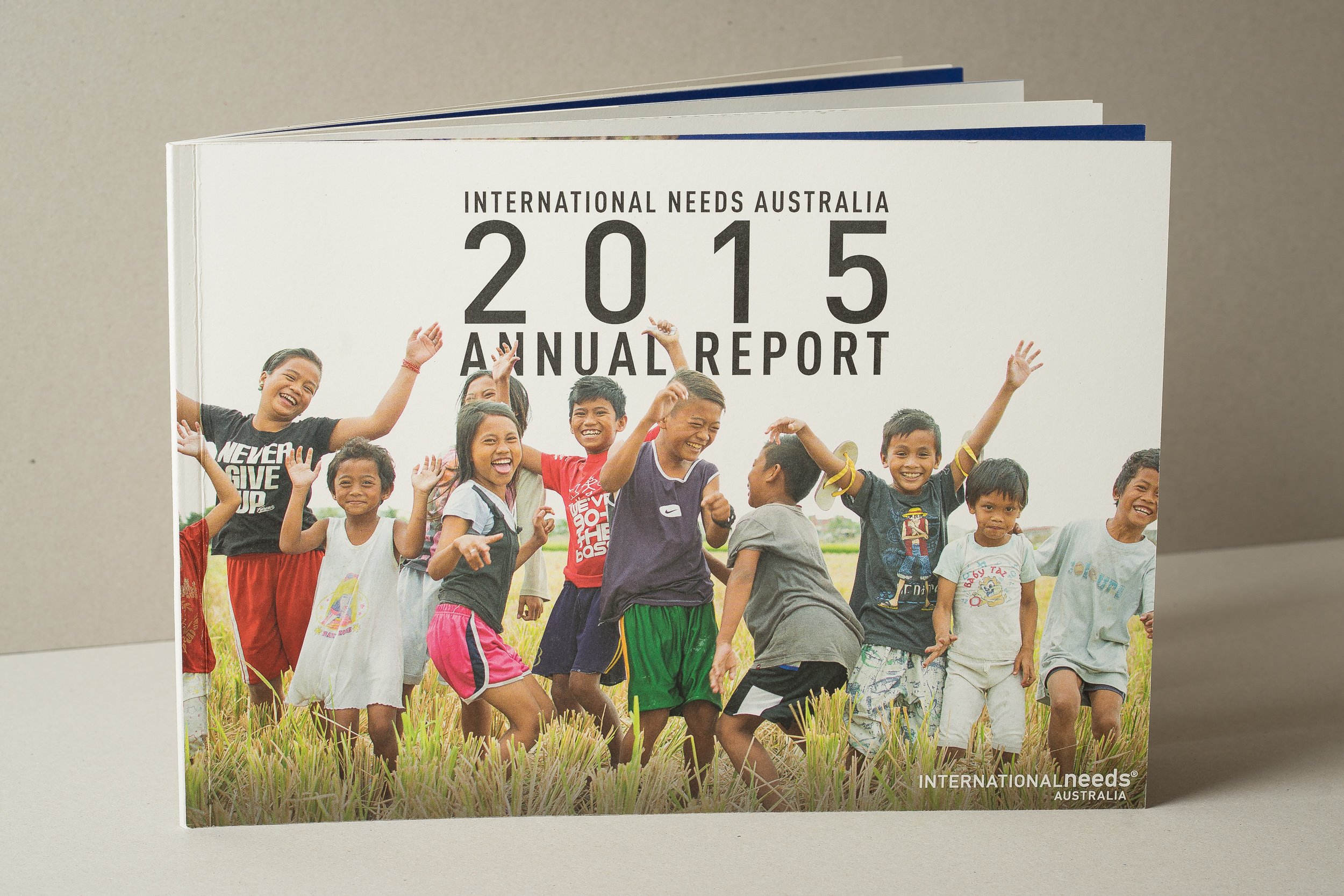
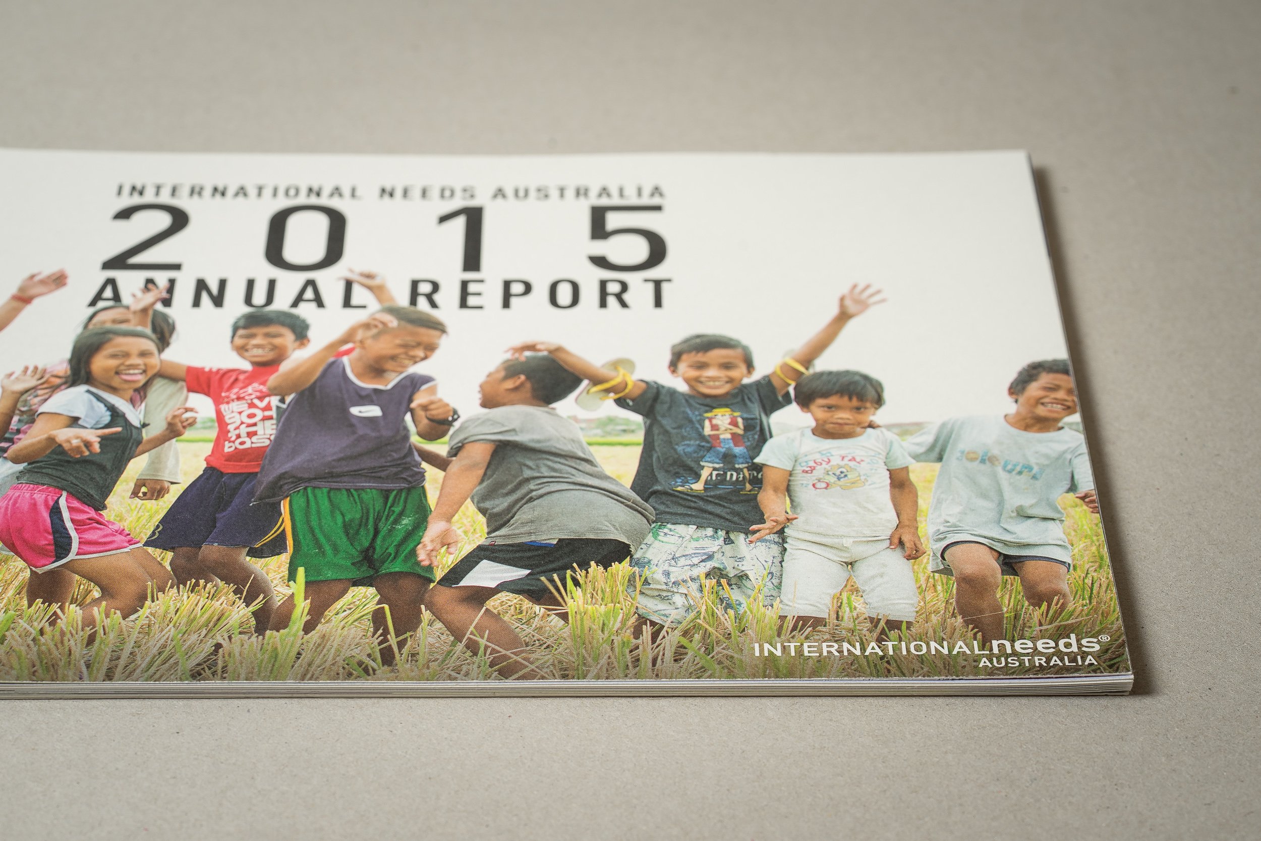
As mentioned, I also designed the 2015 Annual Report, but as I wasn't blogging when I designed that report I thought I would show the photos of it here. The front cover photo was taken on my trip to the Philippines and it is one of my favourites!